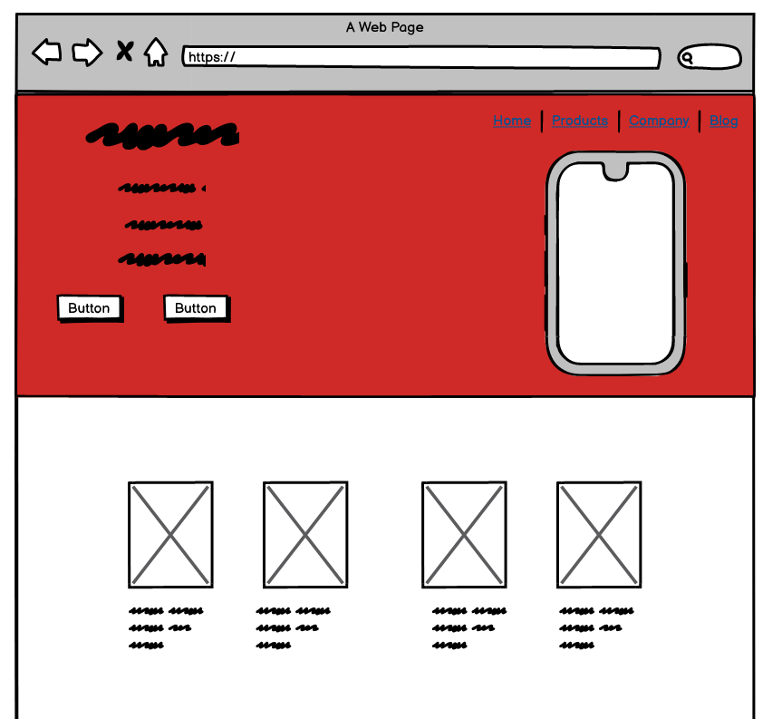
d1. Wireframing
a low fidelity representation of your design(low fidelity = low resolution)
What is a wireframe?
웹사이트 와이어 프레임 (Website wireframe)
페이지 회로도 또는 화면 청사진이라고도하는 웹 사이트 와이어 프레임은 웹 사이트의 골격 프레임 워크를 나타내는 시각적 가이드입니다. 와이어 프레임은 특정 목적을 가장 잘 달성하도록 요소를 배열하기 위해 만들어졌습니다.

2. Mock-up
a high fidelty representation of your web
Workflow
By looking at other's web sites.
1.Simple sketch
2.mock up
3.prototype
dribbble - search by color
Frontier Development Lab - Awwwards SOTD
This cinematic microsite celebrates the breakthroughs of NASA’s Frontier Development Lab and the AI technologies that have made them possible with help...
www.awwwards.com
UI-Patterns.com
Create an account to upload screenshots of great design. We believe that the activity of keeping and collecting screenshots of great design makes you a great designer yourself. A good way to start a design process is to get inspired by what others have don
ui-patterns.com
Dribbble - Discover the World’s Top Designers & Creative Professionals
Discover the world’s top designers & creatives Dribbble is the leading destination to find & showcase creative work and home to the world's best design professionals. Sign up
dribbble.com
Balsamiq Cloud
Fast, Approachable, Collaborative Wireframing
balsamiq.cloud
1. wireframe
balsamiq - collaborative tool
Make Navigation Bar
Expand navbar side by side (collapsing) & Navbar-Brand
navbar-expand-lg
: expand to horizontally and "lg" means large
tindog brand is achieved from 'navbar-brand', an anchor works best.
<nav class='navbar navbar-expand-lg navbar-dark bg-dark'>
    <a class='navbar-brand' href=''>tindog</a>
    <ul class='navbar-nav'>
        <li class='navbar-item'>
            <a class='nav-link' href=''>Contact</a>
        </li>
        <li class='navbar-item'>
            <a class='nav-link' href=''>Pricing</a>
        </li>
        <li class='navbar-item'>
            <a class='nav-link' href=''>Download</a>
        </li>
    </ul>
</nav>
Margin
Bootstrap has margin class that is called as margin-left, "ml".
Thus, applying "ml-auto" to "ul" element to spacing from brand element.
<ul class='navbar-nav ml-auto'>
Make dropdown menu as narrowing site's size (hamburger menu)
a div that contains everything that is collapsable and put it inside that div.

<nav class='navbar navbar-expand-lg navbar-dark bg-dark'>
    <button class="navbar-toggler" type="button" data-toggle="collapse" data-target="#navbarTogglerDemo02" aria-controls="navbarTogglerDemo02" aria-expanded="false" aria-label="Toggle navigation">
      <span class="navbar-toggler-icon"></span>
    </button>

    <div class='collapse navbar-collapse' id="navbarTogglerDemo02">
        <a class='navbar-brand' href=''>tindog</a>
        <ul class='navbar-nav ml-auto'>
            <li class='navbar-item'>
                <a class='nav-link' href=''>Contact</a>
            </li>
            <li class='navbar-item'>
                <a class='nav-link' href=''>Pricing</a>
            </li>
            <li class='navbar-item'>
                <a class='nav-link' href=''>Download</a>
            </li>
        </ul>
    </div>
</nav>
Keep brand with button
See the location of anchor tag

<nav class='navbar navbar-expand-lg navbar-dark bg-dark'>
    <a class='navbar-brand' href=''>tindog</a>
    <button class="navbar-toggler" type="button" data-toggle="collapse" data-target="#navbarTogglerDemo02" aria-controls="navbarTogglerDemo02" aria-expanded="false" aria-label="Toggle navigation">
      <span class="navbar-toggler-icon"></span>
    </button>

    <div class='collapse navbar-collapse' id="navbarTogglerDemo02">

        <ul class='navbar-nav ml-auto'>
            <li class='navbar-item'>
                <a class='nav-link' href=''>Contact</a>
            </li>
            <li class='navbar-item'>
                <a class='nav-link' href=''>Pricing</a>
            </li>
            <li class='navbar-item'>
                <a class='nav-link' href=''>Download</a>
            </li>
        </ul>
    </div>
</nav>'Web Dev' 카테고리의 다른 글
| Introduction to Bootstrap - PART III (0) | 2020.12.24 |
|---|---|
| Introduction to Bootstrap 4 - PART II (0) | 2020.12.24 |
| Installation Bootstrap 4 (0) | 2020.12.23 |
| Intermediate CSS - Confusing part: Box, Border (0) | 2020.12.23 |
| Intermediate CSS - PART II (0) | 2020.12.22 |


댓글