1. Static and Relative Positioning
CSS positioning
5-1. Content is Everything
5-2. Order Comes From Code
5-3. Children sit on parents

Position
1. Static(default): go along with html
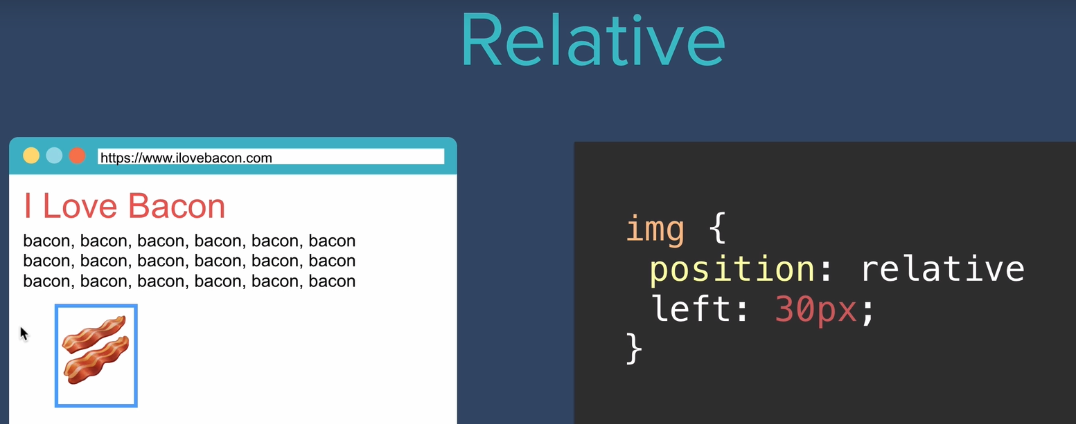
2. Relative
3. Absolute
4. Fixed
Relative Positioning
relative and left
Coordinates
- Top
- Bottom
- Left
- Right
** relative top 50 means 50 margin from top by overlapping
**relative** to its origin !
** relative doesn't affect any other elements.

{position: relative} doesn't do anything without any coordinates changes
Ex)

<body>
  <div class='red'></div>
  <div class='blue'></div>
  <div class='yellow'></div>
</body>
.red {
height: 100px;
width: 100px;
background-color: red;
position: relative;
}
.blue {
height: 100px;
width: 100px;
background-color: blue;
position: relative;
bottom: 100px;
left: 100px;
}
.yellow {
height: 100px;
width: 100px;
background-color: yellow;
position: relative;
bottom: 200px;
left: 200px;
}
To change the order, the only changes in code below are add left coor to apply "red class" to left margin and eliminate left margin from "blue class".

<body>
  <div class='red'></div>
  <div class='blue'></div>
  <div class='yellow'></div>
</body>
.red {
height: 100px;
width: 100px;
background-color: red;
position: relative;
left: 100px;
}
.blue {
height: 100px;
width: 100px;
background-color: blue;
position: relative;
bottom: 100px;
}
.yellow {
height: 100px;
width: 100px;
background-color: yellow;
position: relative;
bottom: 200px;
left: 200px;
}Absolute Positioning

img's parent is div.
So meaning of absolute position of right 30px in img is to be right side of div.
Can be confusing But
Relative VS. Absolute
Relative: relative to its original location.
Absolute: adding a margin to its parent element

Another example of Absolute position

then make red div to absolute position and right 20px
What would happen?
blue and yellow divs are shifted to the very top.

.red {
  height: 100px;
  width: 100px;
  background-color: red;
  position: absolute;
  right: 20px;
}

.blue {
  height: 100px;
  width: 100px;
  background-color: blue;
}

.yellow {
  height: 100px;
  width: 100px;
  background-color: yellow;
}
To make img below

Tricky(?) part was body's default margin

see that there is a margin.
Thus, we have to make it zero margin.
body {
  margin:0px;
}

.red {
  height: 100px;
  width: 100px;
  background-color: red;
  position: absolute;
  left: 200px;
  top: 200px;
}

.blue {
  height: 100px;
  width: 100px;
  background-color: blue;
  position: absolute;
  left: 100px;
  top: 100px;
}

.yellow {
  height: 100px;
  width: 100px;
  background-color: yellow;
  position: absolute;
}
Combination of relative and absolute
Parent doesn't always to be body.

<body>
  <div class='red-parent'>
    <div class='red'></div>
  </div>

  <div class='blue'></div>
  <div class='yellow'></div>
</body>
body {
margin:0px;
}
.red-parent {
position: relative;
height: 300px;
width: 300px;
background-color: grey;
}
.red {
height: 100px;
width: 100px;
background-color: red;
position: absolute;
left: 200px;
}
.blue {
height: 100px;
width: 100px;
background-color: blue;
position: absolute;
left: 100px;
}
.yellow {
height: 100px;
width: 100px;
background-color: yellow;
position: absolute;
}
To make this

body {
  margin:0px;
}

.red-parent {
  position:relative;
  height: 300px;
  width: 300px;
  background-color: grey;
}

.red {
  height: 100px;
  width: 100px;
  background-color: red;
  position: absolute;
  left: 200px;

}

.blue {
  height: 100px;
  width: 100px;
  background-color: blue;
  position: absolute;
  left: 100px;
  top:0;
}

.yellow {
  height: 100px;
  width: 100px;
  background-color: yellow;
  position: absolute;
  top:0;
}
Fixed Positioning
Fixed position: doesn't change it's position as scrolling.

.yellow {
height: 100px;
width: 100px;
background-color: yellow;
position: fixed;
top:0;
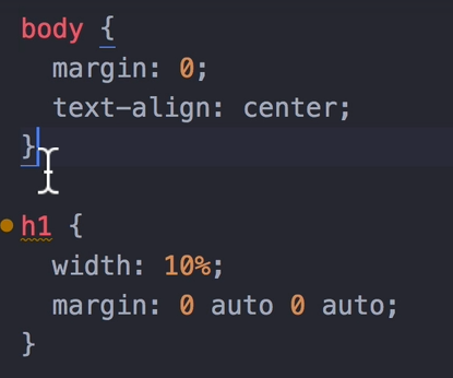
}2. Center
Two ways:
- inside body element make text-align as center
- inside header element make margin as 0 auto 0 auto (top right bottom left)
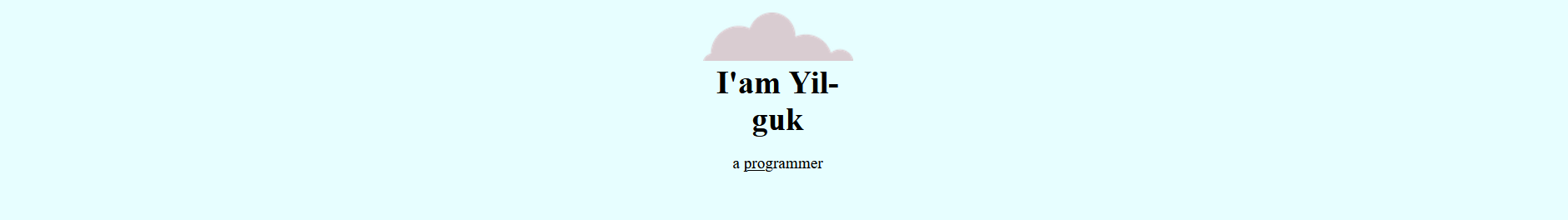
Make center align mountain img and two clouds to the right-top, left-bottom.

<!DOCTYPE html>
<html lang="en">
<head>
    <meta charset="UTF-8">
    <meta name="Seo Yil Guk" content="width=device-width, initial-scale=1.0">
    <title>Seo Yil Guk</title>
    <link rel="stylesheet" href="css/styles.css">
    <link rel="icon" href="favicon.ico">
</head>
<body>
    <div class="top-container">
        <img class='top-cloud' src="images/cloud.png" alt="cloud-img">
        <h1>I'am Yil-guk</h1>
        <p>a <span class="pro">pro</span>grammer</p>
        <img class='bottom-cloud' src="images/cloud.png" alt="cloud-img">
        <img src="images/mountain.png" alt="mountain-img">
    </div>
    <div class="middle-container">

    </div>
    <div class="bottom-container">

    </div>

</body>
</html>
body {
margin: 0;
text-align: center;
}
h1 {
margin-top: 0;
}
.top-container {
background-color: rgb(231, 254, 255);
position: relative;
padding-top: 100px;
}
.middle-container {
background-color: red;
width: 200px;
height: 200px;
}
.bottom-container {
background-color: yellow;
width: 200px;
height: 200px;
}
.pro {
text-decoration: underline;
}
.top-cloud {
position: absolute;
right: 300px;
top: 50px;
}
.bottom-cloud {
position: absolute;
left: 300px;
bottom: 300px;
}3.
font-family
The font-family property lists one or more font families, separated by commas. Each font family is specified as either a <family-name> or a <generic-name> value.
웹 제작자는 font-family 목록에 최소 한 개의 generic family를 추가해야 하는데, 시스템이나 @font-face 규칙을 이용 해 다운로드 받은 폰트 중에 특정 폰트가 있다는 것을 보장할 수 없기 때문입니다. generic family는 브라우저가 대체할 수 있는 폰트가 필요한 경우 선택할 수 있게 해줍니다.
ex.
font-family: Arial, Helvetica, sans-serif;
first two font are family name, last one is generic family.
If first font is not available in certain browser, then next font replaced and again again.
- web safe fonts
www.w3schools.com/cssref/css_websafe_fonts.asp
CSS Web Safe Fonts
CSS Web Safe Fonts Best Web Safe Fonts for HTML and CSS The following list are the best web safe fonts for HTML and CSS: Arial (sans-serif) Verdana (sans-serif) Helvetica (sans-serif) Tahoma (sans-serif) Trebuchet MS (sans-serif) Times New Roman (serif) Ge
www.w3schools.com
CSS Font Stack: Web Safe and Web Font Family with HTML and CSS code.
Join to access discussion forums and premium features of the site.
www.cssfontstack.com
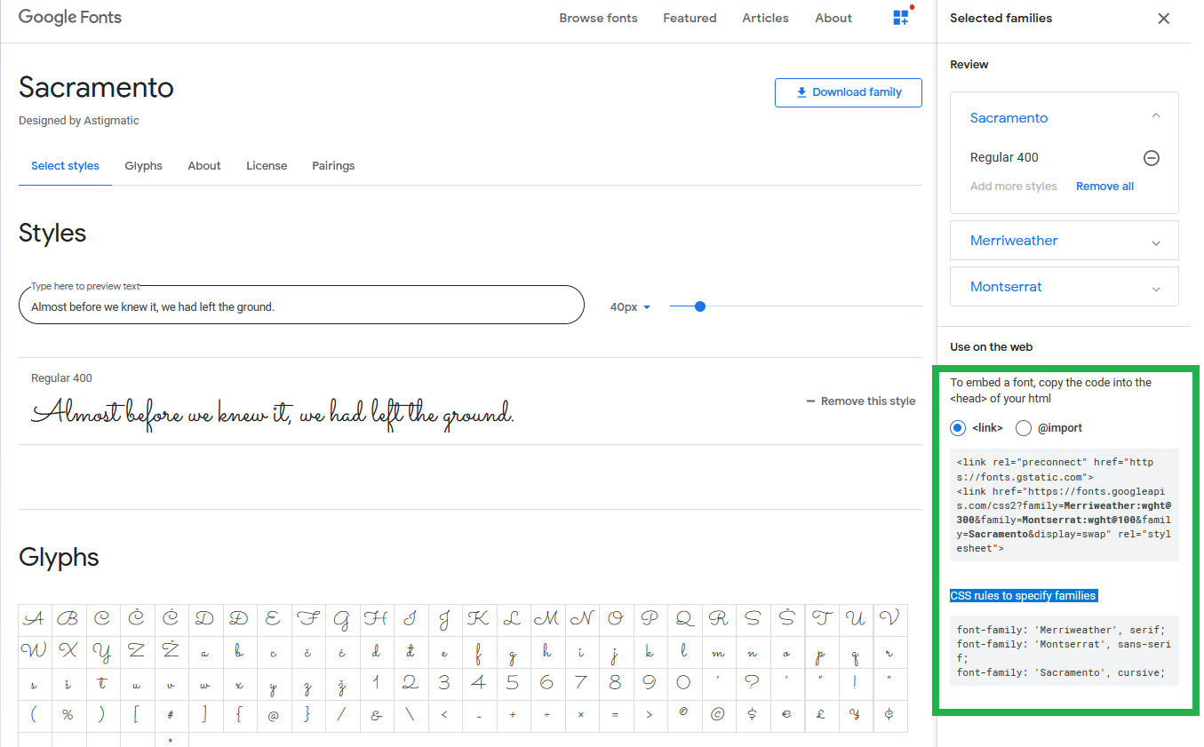
** font embedding
Force to have the fonts you want to display by embedding.
Google Fonts
Making the web more beautiful, fast, and open through great typography
fonts.google.com
- Go to this site and select the fonts you favor.
- Put the link right side of the page to inside head element.
- Copy the CSS rules to specify families in your styles.css file.
4. Adding Contents
채움글
Before making contents by filling this, we can preview the contents.
Lorem Ipsum – Generator, Origins and Meaning
Generate Lorem Ipsum placeholder text for use in your graphic, print and web layouts, and discover plugins for your favorite writing, design and blogging tools. Explore the origins, history and meaning of the famous passage, and learn how Lorem Ipsum went
loremipsum.io
로렘 입숨 (Lorem ipsum)
로렘 입숨은 출판이나 그래픽 디자인 분야에서 폰트, 타이포그래피, 레이아웃 같은 그래픽 요소나 시각적 연출을 보여줄 때 사용하는 표준 채우기 텍스트로, 최종 결과물에 들어가는 실제적인 문장 내용이 채워지기 전에 시각 디자인 프로젝트 모형의 채움 글로도 이용된다. 위키백과
font-size
if users change browser's fontsize, font-size changes.
To deal with this, we need dynamic font-size by using "%".
100% == 16px
Another way to deal with is "em".
1em means one size of capital letter M.
1em == 16px
Thus, 100% = 1em = 16px.
why we need to know about "em"?
some sites use "em" and some use "%".
Why is matter using dynamic font-size?
It's inherited.
If body's font-size is "2em" and its children, i.e., h1's font-size is "5em", then h1's font-size becomes 7em.
This is applied to the same as "%".
Be careful when using dynamic font-size since it's inherited.
Here comes "rem".
Relative to its root.
It doesn't matter how much parent's font-size is since it is relative.
Recommmended: Using "rem" least error-prone.
5. Float and Clear
What Float does?
float 은 한 요소(element)가 보통 흐름(normal flow)으로부터 빠져 텍스트 및 인라인(inline) 요소가 그 주위를 감싸는 자기 컨테이너의 좌우측을 따라 배치되어야 함을 지정합니다.

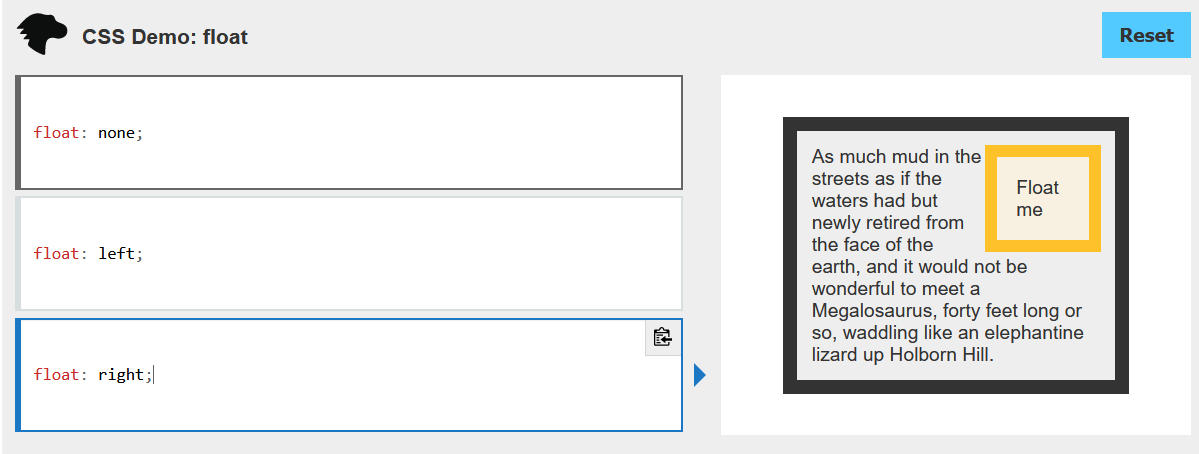
What Clear does?
CSS 속성은 요소가 선행 부동(floating) 요소 다음일 수 있는지 또는 그 아래로 내려가(해제되어(cleared))야 하는 지를 지정합니다. clear 속성은 부동 및 비부동 요소 모두에 적용됩니다.


Caution!!
Float is most commoly used and abused CSS properties.
Recommended: Only using wrapping text
Frontend Mentor | Front-end coding challenges using a real-life workflow
Improve your front-end skills by building real projects. Solve real-world HTML, CSS and JavaScript challenges whilst working to professional designs.
www.frontendmentor.io
'Web Dev' 카테고리의 다른 글
| Installation Bootstrap 4 (0) | 2020.12.23 |
|---|---|
| Intermediate CSS - Confusing part: Box, Border (0) | 2020.12.23 |
| Intermediate CSS - PART I (0) | 2020.12.22 |
| CSS - Introduction to CSS (0) | 2020.12.22 |
| Introduction to HTML (0) | 2020.12.21 |


댓글