1. Why we need Javascript and JQuery? (Setting up project)
Toggle's not working
At first, Its toggle not seemes to work in our project's html.
But on the codeply, it works.
Why?
Because in order for the booststrap collapsable menu to work, need Javascript and JQuery.
How to make it work?
Choose one of them, bundle or separate.
As docs says, bundle inclueds Popper itself, not JQuery.
So only two lines of codes will work.
But if you want separate them, use three lines of codes at the bottom that separates bootstrap bundle Js and Popper.

insert bundles (two lines) below bootstrap cdn code.

Javascript is responsible for any behaviors.
2. Bootstrap Grid Layout.
Responsive classes
Bootstrap’s grid includes five tiers of predefined classes for building complex responsive layouts. Customize the size of your columns on extra small, small, medium, large, or extra large devices however you see fit.
All breakpoints
For grids that are the same from the smallest of devices to the largest, use the .col and .col-* classes. Specify a numbered class when you need a particularly sized column; otherwise, feel free to stick to .col.
Grid options
While Bootstrap uses ems or rems for defining most sizes, pxs are used for grid breakpoints and container widths. This is because the viewport width is in pixels and does not change with the font size.
See how aspects of the Bootstrap grid system work across multiple devices with a handy table.
Extra small<576px Small≥576px Medium≥768px Large≥992px Extra large≥1200pxMax container widthClass prefix# of columnsGutter widthNestableColumn ordering
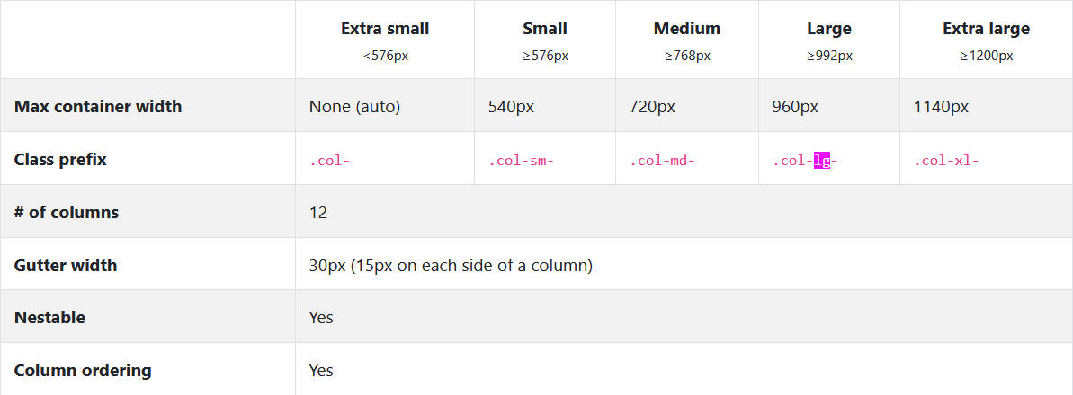
100% consists of 12 columns

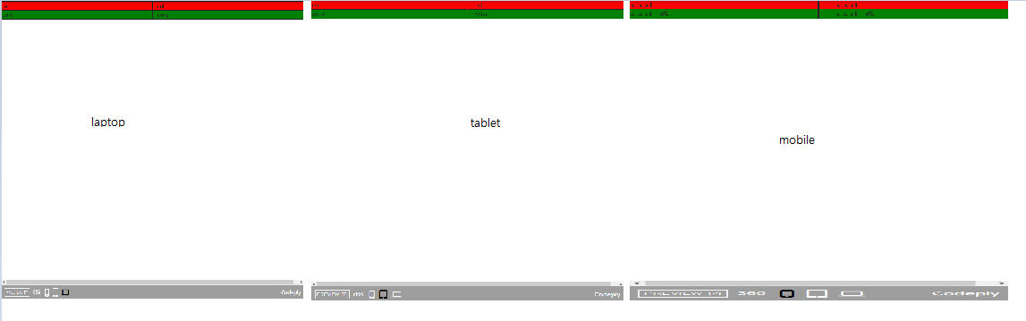
All the same result regardless of viewports.
Stacked to horizontal
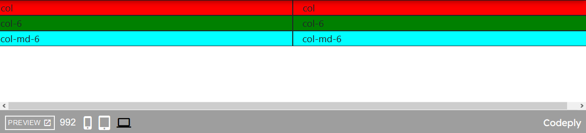
Using a single set of .col-sm-* classes, you can create a basic grid system that starts out stacked and becomes horizontal at the small breakpoint (sm).
ex. md: medium
ah
<div class='row'>
    <div class='col-md-6' style='background-color:cyan; border: 1px solid'>
        col-md-6
    </div>
    <div class='col-md-6' style='background-color:cyan; border: 1px solid'>
        col-md-6
    </div>
</div>


Multiple breakpoints
<div class='row'>
    <div class='col-lg-2 col-md-3 col-sm-12' style='background-color:magenta; border: 1px solid'>
        col-lg-2 col-md-3 col-sm-12
    </div>
    <div class='col-lg-2 col-md-3 col-sm-12' style='background-color:magenta; border: 1px solid'>
        col-lg-2 col-md-3 col-sm-12
    </div>
    <div class='col-lg-2 col-md-3 col-sm-12' style='background-color:magenta; border: 1px solid'>
        col-lg-2 col-md-3 col-sm-12
    </div>
    <div class='col-lg-2 col-md-3 col-sm-12' style='background-color:magenta; border: 1px solid'>
        col-lg-2 col-md-3 col-sm-12
    </div>
    <div class='col-lg-2 col-md-3 col-sm-12' style='background-color:magenta; border: 1px solid'>
        col-lg-2 col-md-3 col-sm-12
    </div>
    <div class='col-lg-2 col-md-3 col-sm-12' style='background-color:magenta; border: 1px solid'>
        col-lg-2 col-md-3 col-sm-12
    </div>
</div>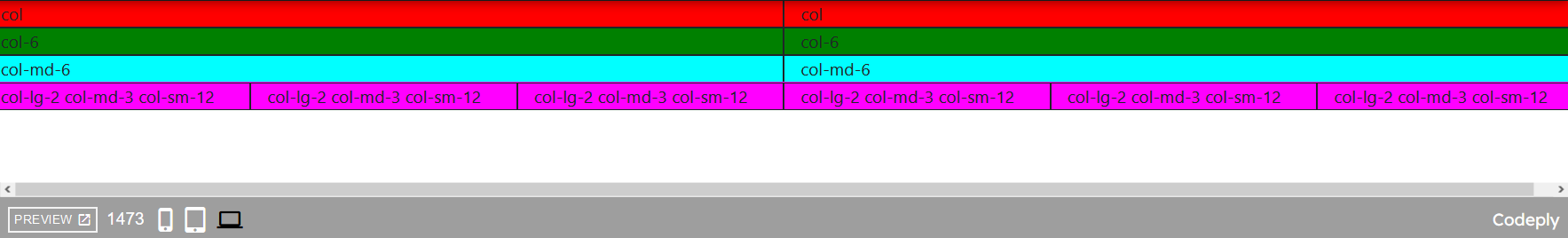


'Web Dev' 카테고리의 다른 글
| Intermediate CSS - PART I (0) | 2020.12.25 |
|---|---|
| Introduction to Bootstrap - PART III (0) | 2020.12.24 |
| Introduction to Bootstrap 4 - PART I (0) | 2020.12.24 |
| Installation Bootstrap 4 (0) | 2020.12.23 |
| Intermediate CSS - Confusing part: Box, Border (0) | 2020.12.23 |


댓글